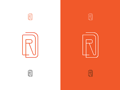
Personal Brand — Monogram Concept Cont'd
On the left we have rounded errythang, and on the right we have some straight-edged corners. I think I'm really liking the mixture of curve and straight for this one! Kind of calls out the Ds a bit more deliberately? I fixed some of the geometry a bit too (literally shifting pixels). At this point, the right one is my fav.
What do you guys think? Thanks again for looking!
brand
branding
design
designer
graphic design
graphic designer
illustration
illustrator
logo
logo design
mark
monogram
View all tags
Posted on
Feb 14, 2017
More by Régine Carreras View profile
Like


