Alerter Group style guide


In January, my client rebranded from Deaf Alerter to Alerter Group as they've extended their product line. The logo was designed in house so I was tasked with tweaking the website to fit in with this new logo.
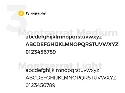
I decided to introduce new typefaces that match the new logo better and as well as different shades of yellow to use throughout the brand. The secondary colours are the colours already used for each product Alerter Group sells.