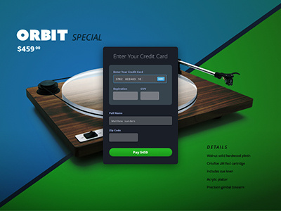
Credit Card Checkout - Daily UI 002
Day 2: The idea I had for this credit card form was to have a simple, but elegant overlay on a landing page with clear inputs from the user. I was torn between a light or dark color form but ended up choosing a dark tone to match the mood of the landing page. Please share any and all thoughts. Thank you in advance!
View all tags
Posted on
Jan 30, 2017
More by Matt Landers View profile
Like


