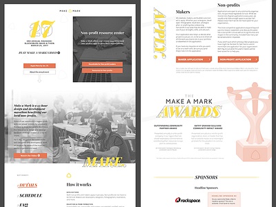
About Section

Each year, I've redesigned the Make a Mark website for that year's event.
This year's is my favorite so far! You can see it live, here: http://letsmakeamark.org
Some goals we discussed were breaking up the design, so it doesn't feel blocky. The audience is mostly designers & developers that would appreciate a modern, design-forward page. We also wanted to add dimension with elements that surprise, or break the norm on most websites. We wanted it to show a smart use of color and typography.
Most importantly, we wanted to make sure the site didn't feel like a product or agency website. Instead, we wanted it to feel more like a magazine.