


New Brand Identity


When GoDaddy creates a new brand, we eschew the old and embrace the bold. Here’s what happened when we put our best design minds in one place.
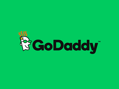
First, that font. It’s both literally and figuratively bold--a custom creation with roots in Boing but a distinctly GoDaddy vibe. The spur on the “G” has been transformed into an arrow head that symbolizes both the company’s ascension and the optimism of our customers. Neat, huh?
Not to be outdone, the GoDaddy head has been revised, streamlined, and polished. Look for him to appear in upcoming television ads. Is he Super Bowl bound? That I can’t tell you, but I will say we also freshened up the GoDaddy color palette. You’ve seen orange and green before, but never quite like we’re gonna do it.
The lesson here is that working fearlessly, owning outcomes, and joining forces can result in spectacular things--including a bold new brand.