


GameBoy Advance

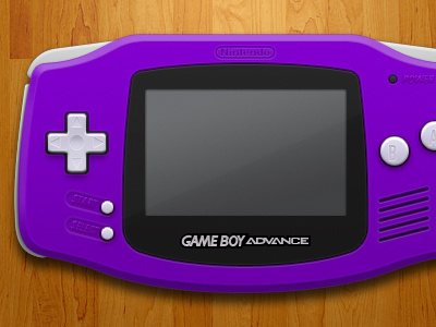

GameBoy Advance graphic for the Controls section under preferences (see additional attached image for reference).
I chose the purple or Indigo version as it was the one that Nintendo seemed to promote the most along with the GameCube at the time.
I think the semi-opaque or 'Glacier' one was more popular, and it would have been way more fun to do, but, I thought that the matte color versions would make it easier to 'read'. It has less going on and not so busy looking. Also, because I used the purple in the sidebar and wanted some consistency.