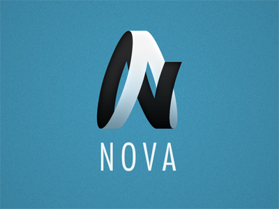
NOVA
This was unused concept for a client. It's based off of a mobius strip, and I really liked the abstract letterforms I made. The original logo had a slightly different 4-letter name (including an A and N), but I thought 'NOVA' was more appropriate because this mark gives me an 'aerospace' vibe.
Thoughts?
aerospace
black
blue
brand identity
circle
clean
client
concept
ellipse
logo
mark
mobius strip
nova
white
View all tags
Posted on
Jun 29, 2010
More by Rob Loukotka View profile
Like

