Creative + Technology icon

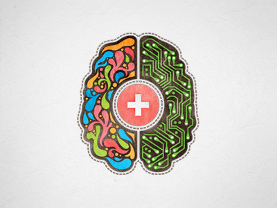
A small piece of the complete rebranding overhaul of Lifeblue, the interactive agency I work for. This will be used as an icon for a section on the website labeled "Creative + Technolgy". My dilemma, and where I could really use some feedback, is the orientation of the brain (technically, it should be reversed) but this orientation supports the way the section heading reads and also looks better, imo (not sure why). I just don't want to kill the concept. Thoughts?