


Still tweaking...

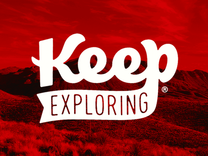
Over the past few weeks I've been attempting to do a little brand refresh for Keep Exploring - A project I started with my friend nearly 4 years ago that tries to encourage people to see everyday life as an adventure.
While it has served its purpose well, the original logotype I designed over 4 years ago is a tad awkward - It is rigid, has a strange balance, and overall doesn't communicate the fun and playful voice our brand has taken on over the years.
Let me know what you think! If this attempt is successful, if you have any critiques, if you think we should ditch this layout entirely and go for a different look... All input welcome! Thanks for your time!