Josefin sans Italic

Work on the Google Fonts Improvement project continues!
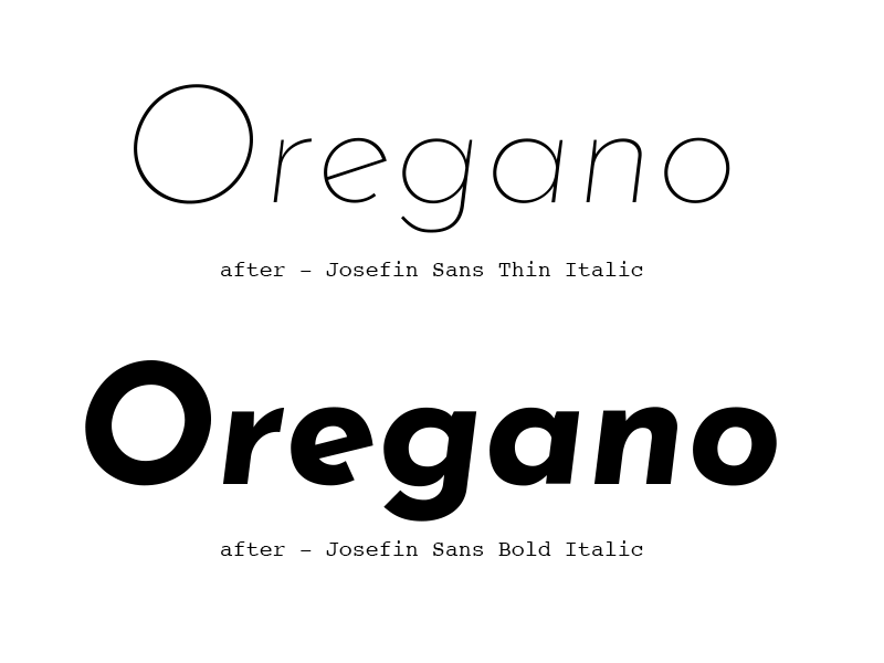
Circling back to Josefin Sans' italic, there's some good points about making italics.
• Round shapes like /O or /e if just skewed linearly will look smooched on some parts of their curve profile, and flat on other parts of the curve.
Doing a transformation of 50% of the italic slant as skew, 50% of the italic slant as rotation, and them optical corrections gives a much better result.