


Pricing Page

This shot is basically an iteration I proposed for a pricing page we're working on. I underestimated how complex a pricing page could actually turn out to be. It's definitely more than just two to three columns next to each other and making sure one of them stands out, blindly hoping for that sweet conversion.
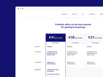
So the problem that the client wanted to solve is how they can emphasize that 41EUR package, over the other two. Of course, this wasn't just a given, I spent most of the discussion asking why this was the case in the first place. The business logic behind it was actually based on some interviews and a survey the client carried out, which is always great to see (rationale being based on objective data coupled with intuition rather than feeling and assumption).
Notice that the prices are descending. I went for this, instead of the conventional middle placement, because I felt this didn't make sense in terms of the order of the prices (i.e 41, 38, 27 vs 27, 41, 38 vs 38, 41, 27). I reaffirmed this hypothesis by actually testing it out and carrying out a quick observational study on the prototype we built. We're still going to be testing iterations, as one can never be too sure.