Logo Exploration - Rebranding a 20+ years company

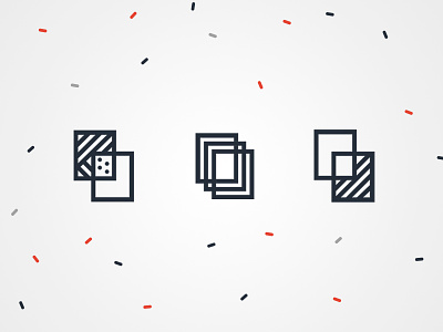
Unfortunately, my client wasn't game enough to go with these funky propositions. I really liked the first one, Where the transparency of the window is expressed by the different patterns.
Full case study: https://goo.gl/XAVoeQ
---
Auroral is a family-owned company manufacturing affordable and high quality windows and doors. Their offer targets residential clients.
They approached me in 2015 to redesign their brand identity.