8 or g?

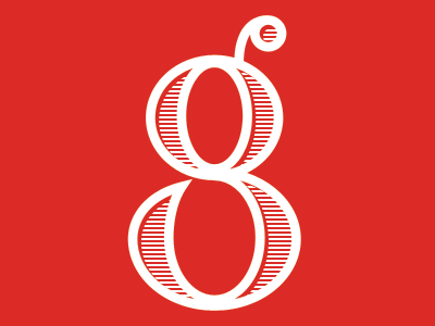
More branding development for an ongoing magazine design. This showcases an iconic setting of the logo. This was intentionally designed to read as an "8" or a "g".
More branding development for an ongoing magazine design. This showcases an iconic setting of the logo. This was intentionally designed to read as an "8" or a "g".