E-Commerce Redesign Concept


Full pixels attached.
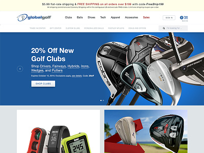
GlobalGolf just celebrated their 10th anniversary as a company. During a meeting the other week there was a conversation of what it would look like if we updated the website. Having been at the company for the last 4 years I decided to mock up a redesign that stays true to much of the current system and brand guidelines we've created over my time at the company to give it a shot at becoming reality (although I doubt it will happen). Product gallery and individual product page mock ups to follow. To compare to our current homepage visit GlobalGolf.com
Some of the current system I retained was:
• Using a system font stack (updated from only Arial to Helvetica Neue). Webfonts aren't an option with our developers.
• All images are 4:3 ratio to take advantage of the image processing system and ability to reuse old promotions
• Typography colors and hierarchy match our html emails that have been in use the last 2 years, more consistent across homepage and newsletters than the current overlay text on the hp
• Similar number of modules available to marketing/merchandising for promotions
• Brand colors and type system/colors for promotion types, categories, and fine print retained
Some of the changes made
• Gradients for buttons have been made more subtle and text shadow/indent has been dropped to give a more modern appearance than web 2.0 appearance from when it was first created
• Promotions that change less often (Golf Digest and Monthly contest) and the main hero promotion have been given art direction flexibility with full width backgrounds
• Header has been tighten up and made more consistent with our current mobile nav (shopping cart etc)
• Shipping promotion moved back to the top of the page to match current interior pages