Thinkified Logo

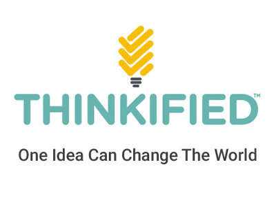
Thinkified has been one of my favorite projects to work on. We used the words 'think' and 'verified' to create a portmanteau.
I first started toying with the idea of a checkmark and a light bulb together. Both the words that make up the name Thinkified have well-established symbols to represent them.
The light bulb is the first image that comes to mind for me as a representation of an idea but it didn't fit the company concept. The light bulb is just too old! It was patented in 1879.
I decided to use a CFL bulb as a more contemporary alternative. I saw the checkmarks right away when I started abstracting the CFL bulb into simple shapes.
I've been a fan of the Gotham typeface for a long time and I had wanted to use it for this kind of project for a while. Finding Gotham Rounded was the happy accident that brought everything together.
All 11 segments of the logo pictogram are made from a Gotham Rounded capital letter I. The lengths are different, but they are still the same thickness. They belong together because they are made from the same elements.
I love this logo because of the way it all came together.