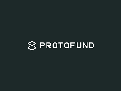
Proto Fund
Company:
Early stage venture capital group
Deliverables:
Name, icon, and fully custom wordmark
Intended Feel:
Futuristic yet understated
Status:
Unused
Icon Notes:
The concept behind the icon is the foundation of a company (the square) being elevated by the fund (the circle).
Wordmark Notes:
One of the more difficult decisions was whether or not to drop the space between "proto" and "fund". Having no space creates in a cleaner aesthetic but introduces the risk of reduced legibility. Feedback from both designers and non-designers consistently showed no legibility issue. This is presumably because both words are highly recognizable (I only tested fluent English speakers, though).
branding
futuristic
icon
identity
illustration
logo
minimal
typography
vector
venture capital
wordmark
View all tags
Posted on
Oct 13, 2016
More by Conway Anderson View profile
Like

