Laurence King Catalog Redesign!

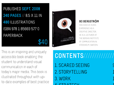


Better shots of this project! Check out the attached files for more of this 16 page (8 spread) catalog redesign. The concept for this catalog was to make the information that would be most important to students the most important (costs of book, edition, author, etc).
NOTE: I am not sure why the lighter weight of the font appears to be illegible in the PNGs. When I got this booklet printed (my teacher still has it, I am getting it reprinted as soon as I can) the copy appeared fine.
