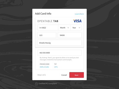
Tab Web Registration
I updated our credit card form to look more like... you guessed it: a credit card. It saves a bunch of space, and looks more inviting and familiar to users. I utilize progressive disclosure throughout the form to make it feel less heavy right out of the gate. For instance, the Month and Date fields only appear after the CC number is added, and a picker for Tip only appears when the user taps on 20%.
Check out the attachment to see what it looked like before! I was previously trying to follow our web patterns to a T, but decided to revisit it when the number of forms grew to an intimidating number.
Give our OpenTable team a follow if you like this shot!
View all tags
Posted on
Sep 21, 2016
More by OpenTable Design View profile
Like


