App icon

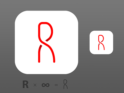
I'm playing with this design for a mark / app icon. Readability of the 'R' is important.
It's for an application that helps you take several moments each day to notice your own existence through stillness.
What do you think of the result so far? Thoughts and feedback are very welcome.