Artup

Artup - Logo Concept.
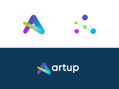
It seems like many different logos have been done that are similar to this 'a' design. Although I never saw a 100% similar version before. For now this is the first (out of many others) concepts that I made for Artup, a creative startup company (cant say much more at this point).
Each letter stands for a 'dot' and 'color' and have a different meaning. In the top left I included a little explanation on how this design is build.
Happy to hear your thoughts!