


New Concentric Logomark


Since we're celebrating 10 years and have taken the business full-time this year, we've decided it's time to update our identity. Doing work for yourself is always the hardest, so I'd love some feedback!
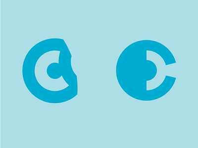
Which logomark do you prefer? And take a look at the attachment and let me know what you think about the full logo options.
The left one is meant to look like concentric circles being peeled back, forming a C. The right is using negative space to allude to C, D and concentric circles.