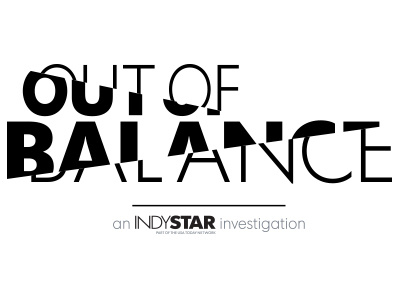
Out of Balance - series logo
This was the final logo for our "Out of Balance" investigative series. The investigation focuses on the sport of gymnastics and some of the predatory coaches who were allowed to continue to coach after many red flags and complaints.
Someone early on had suggested a balance beam that was at an angle. Somehow that suggestion took me down a road that developed into this final solution. It plays on an off-balance theme while at the same time avoiding having to angle text or images to literally throw the logo 'off balance'.
I have attached the version that also appeared with an image.
Here is the investigation. http://www.indystar.com/topic/out-of-balance/local
More by Michael Campbell View profile
Like


