VSCO Filter Store


Hey! Another little piece of the VSCO app redesign that I'm doing.
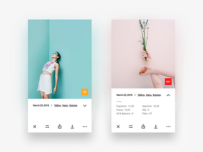
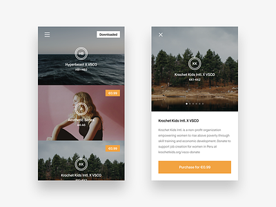
This time it's filter store screens. These are pretty much the same that the current VSCO app uses but with some little differences. First I had to tweak the colors a bit. Before the brand color of the app that I used was more yellowish, now it's orange.
Another thing is that now the menu icon is at the top left corner, not at the top right corner. That was made to enhance the general user experience and comfort. For this part I had to do a little research to be sure that usage of the menu button on the left side would be appropriate. Though the majority of apps have this button on the right side, I found many great and popular apps and social networks using this button on the left side. So it's definitely not wrong here, I assure you 😉
And a little addition to the Filter Store Item screen. I added slider dots so you'd be able to scroll through different examples of photography using the filters from the pack. I think it's better than scrolling all the way down to see the examples in the current app.
Hope you'll like this and stay tuned for new updates 👊