Explaining color harmony

Explaining colors harmony to my colleagues, who don't have any training on colors.
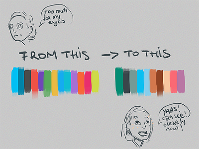
My point being that having a scattered palette like the one chosen for the website (on the left is) is more distracting visually than the one I'm proposing for the app.
Having a restricted palette, rather than a scattered one helps you to focus and allows you to have accent colors that guides you attention on the important elements.
It's a sport plateform, and the idea was to have a color for assigned to each sport categories (blue for aquatic, red for combat and so on...). On a user experience, in the research section, it gets really confusing because of all the colors in your face.
I'm still finding a solution to have a smooth and easy way to find a sport that you'd like to practice near you. To match this goal the search engine and the way you use it gonna be on point.
If per any chance it happens you speak French, here's the website in question : Windoo.fr
___
My instagram, Portfolio, Tumblr & Twitter