Loop

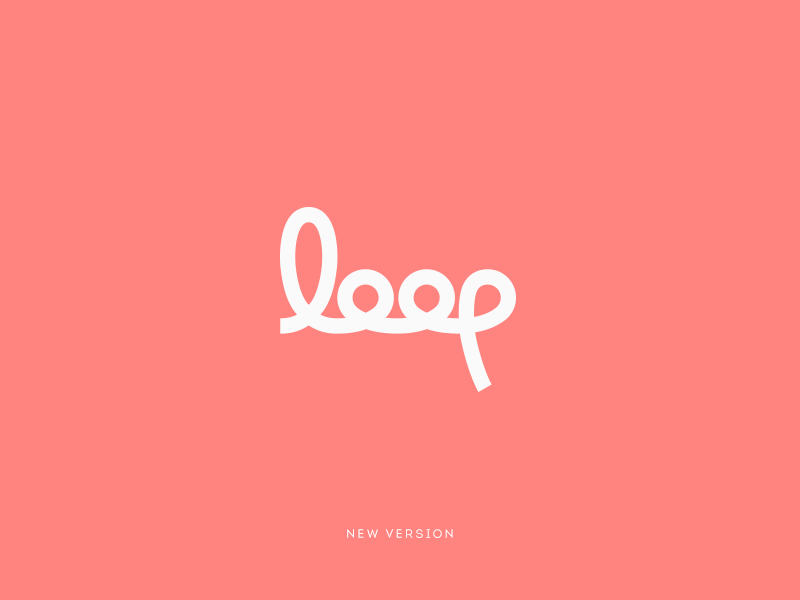
After some careful consideration I have finished the loop logo. The p in the original created the appearance of a left slant. To rectify this, it needed some minor adjustments to the stem of the p. Creating more unity between the curves of the l and p.
I did try a few things that you kind people suggested but these did not work as the main concept for the logo is obviously loop, looping, but inside the o's are a map pin. Joining the circles at the top instead of the bottom took away this detail.
Thank you all for your feedback.