K Icons

Hey guys,
I'm working on fitness related app, and got stuck with app icon. It's really hard for me to decide on colors and overall mark shape 😅
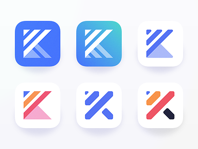
The idea behind the mark is that: K + Barbell + Progress Graph.
1. Which one do you like more?
2. Which mark represent the idea more clearly?