New shopping app - Product details

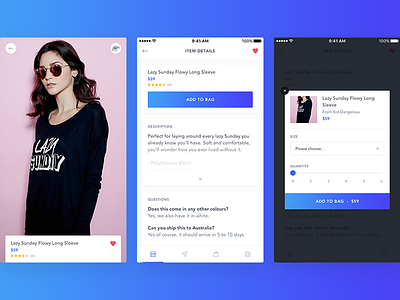
Here's another look at the shopping app project I worked on recently. When looking at an individual product, you're first presented with an almost full screen gallery and the key details at the bottom. Scrolling or tapping that bottom area reveals the rest of the content. While working on a previous shopping app we noticed that users didn't immediately tap the "buy" button when it was up the top of the screen, and instead liked to browse the content a bit first before deciding whether to add to their bag/wishlist or not. Hence why I didn't think it was necessary to have the buy button visible straight away, and instead let the content/product become the focus.
You can also check out the project on our website.
---
We're available for new projects! Get in touch
Check out our Dribbble Team for more work