WLW Group

More than 20 years in the business of welding and fitting services. WLW Group company have not had any corporate identity set up yet. They asked us for the complete brand identity proposal despite successfull market position. Complex identity including unique logotype with custom typography was designed. Font detail´s fine rusts indicate industrial sector. The overall outlook and logotype character places importance on longterm experiences, will and company´s success.
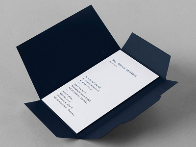
We have chosen combination of quality navy blue paper and silver hot stamp printing technique for the corporate identity. Navy blue symbolises strong tradition and silver colour in logotype refers to steel and aluminum materials employees are working with every day.
Besides the stationery design, our task was to prepare also company website and other presentation materials. We decided not to use stock images but to make a real photoshooting with company employees for this purpose. Reason was simple: real employees, real work, real trust and quality.