Theropoda - Branding

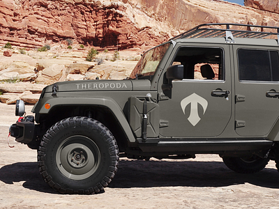
Theropoda Expeditions is a dinosaur fossil excavation and preparation venture based in Texas. They sell specimens to private collections and public. We have been asked to create an elegant brand, considering the exclusivity of this kind of business. We have worked on a meaningful symbol which combines a monogram (the initial letter “T” of the name), a paw (the word Theropoda from Greek meaning “beast feet”), a shield (symbol of safety and prestige) and an arrow facing up (which recalls conceptually the north and the “Expedition”), maintaining a simple and elegant shape. We have designed the typeface of the name Theropoda with some characteristics of the symbol, like the particular shape of the serifs and of the tail of the “R” letter. The main colour is a dark grey with a slight greenish tint, which recalls nature and adventure in a sober way.
Complete Project on Behance:
https://www.behance.net/gallery/37867565/Theropoda-Branding-Dinosaur-Fossil-Excavation