DailyUI Challenge: Credit Card Checkout

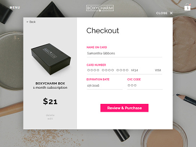
For my #dailyui challenge 002, I decided to redesign an actual checkout form. I decided to redesign the checkout form for BoxyCharm to match the clean, minimal lines of their brand. I also wanted to eliminate the one, long page checkout they have now which seemed too overwhelming. I wanted to make it seem easier with fewer steps and more open space.