Toronto Raptors - #maymadness Day 28

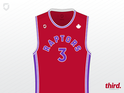
While the Raptors current brand is passable, it is a little bland – there is sufficient evidence at hand that suggests this is directly related to letting rappers screw around with your branding… *cough* Brooklyn *cough*.
A splash of purple from the Raptors original palette sorts some of that ‘blandness’ out. I played around with the idea of some jagged pinstripes inspired by their original away jerseys, but it made everything a little busy, so I took them back out again.