


Tambralyn Ui Ux Web Design Portfolio 89 2

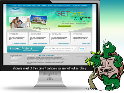
I designed this site back in 2008. I miss the times where the problem to solve was to add so much content on one screen so the user doesn't have to scroll. Using this method the user can find what they are looking for within two clicks. With a page correctly laid out, such as this one, I know what they do, how to call them and where to go to get more information on a particular topic.
Now a days, it seems like a website is just one large image, a logo, and two buttons.. takes 3-4 clicks (and sometimes more) to get to what you desire. Most sites don't even show phone numbers anymore.
(sharing my 2 cents regarding today's designed websites- thanks for reading. Would love your comments.)