Zaritza logo & brand design: alt Soundcloud design mockup

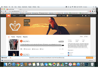
My client was looking for a logo design for her music project called Zaritza, which is a combination of two Russian words: queen and intense sunrise. She thought of incorporating a lot of black color and possibly some shades of sunset or sunrise as well as using the subtle shape of a swan. Later we also added digital asset design to the project to incorporate the new logo on her social media pages: Facebook, Soundcloud, and Bandcamp. We also incorporated the logo onto a business card for a print design.
I designed the logo and brand elements in Adobe Illustrator. My first idea was to incorporate some kind of regal symbol to combine her Russian and American histories. She seemed to like hand or brush type, so I started playing with the ideas of an initial mark either in a symbol or combined with a word mark. At first my idea was to incorporate two eagles to stand in for the ones on Russian & American crests, but she preferred the idea of swans. Working together we came up with a crown-like symbol framed by reflected swan heads cradling and onion dome, which contains a flame and all topped with a single star. She initially wanted to incorporate piano keys or a coda symbol in the center, but after some experimenting, I came up with an initial mark that had musical glyphs that hinted at the idea of the music symbol without overstating it. For the wordmark, we went with a classic inscription style typeface with an urban feel, then modified the letters to hint of her Russian heritage and alphabet.