


Investment App


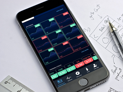
This is one of the examples of nice UI, but bad UX. I'm trying to layout nice graphs to display all stocks that user have bought. Later I found out that this layout doesn't work at all because user want to see more than just the current price.
So yeah, back to drawing board. Hhmm