


car2go Reservation
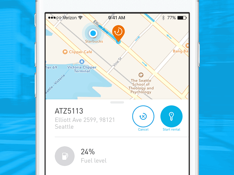


Another change I think would be helpful in the car2go app.
In the current design both the cancel and start buttons are blue and white. When you're rushing to start the rental while you're curbside at the car it's hard to tell which is which at a quick glance.
Changing the buttons to semantically congruent negative and positive colors provides much better usability.
(design matches the current car2go app)