Type Story: App Concept


Full resolution attached. So I have this typographic calendar for 2016 hanging on my wall from Just Type (look it up, it's awesome) and it does a fantastic job in presenting you with a new typeface each month and explaining some fun things about the font while also being very informative about its origin and usage.
For the longest time, I've been going "this would be so awesome as an app!" and I finally decided to sit down and take a stab at what it could potentially look like. It's going to work much better on tablets, so I decided to start with iPad.
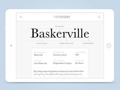
Taking center stage is the typeface itself, with the x-height and ascender/descender baselines marked with light red lines. Some facets of the typeface are called out as annotations, giving a unique feel to each font. This large typeface is pure black in order to stand out from the rest of the content.
Below we have a scrollable card detailing some information about the typeface's creator, origin, and classification. Further down is some history about how it came to be.
Obviously, there's many problems here with the layout not really being scalable on smaller devices (or when type foundry and variation names are really long, for that matter), but I wanted this to be a mood piece that sets the stage in terms of the style and aesthetic for the final product. This is but a starting point to guide me on in future iterations and revisions, and to remind myself of what my initial concept looked like.