New Logo...again

Took some of the comments from my previous logo redesign attempt, and came up with this.
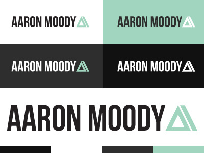
The mark is meant to look like an A, and an M
Thoughts? also, going with a new colour scheme than my usual black and pink, thoughts on that?
Took some of the comments from my previous logo redesign attempt, and came up with this.
The mark is meant to look like an A, and an M
Thoughts? also, going with a new colour scheme than my usual black and pink, thoughts on that?