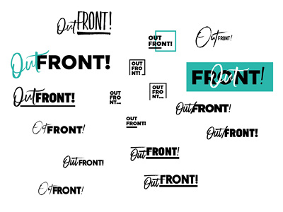
Out Front! Logo

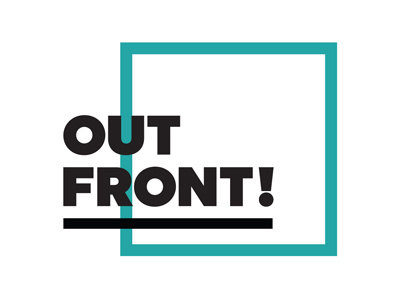
The client, Corey, liked the boldest designs and this is the design we settled on.
I've extended the black line from the original idea. We did play around with concepts without a line and vertically centring the type but both agreed this was the version we liked best. We also felt the teal was stronger than the purple we had originally planned to use.