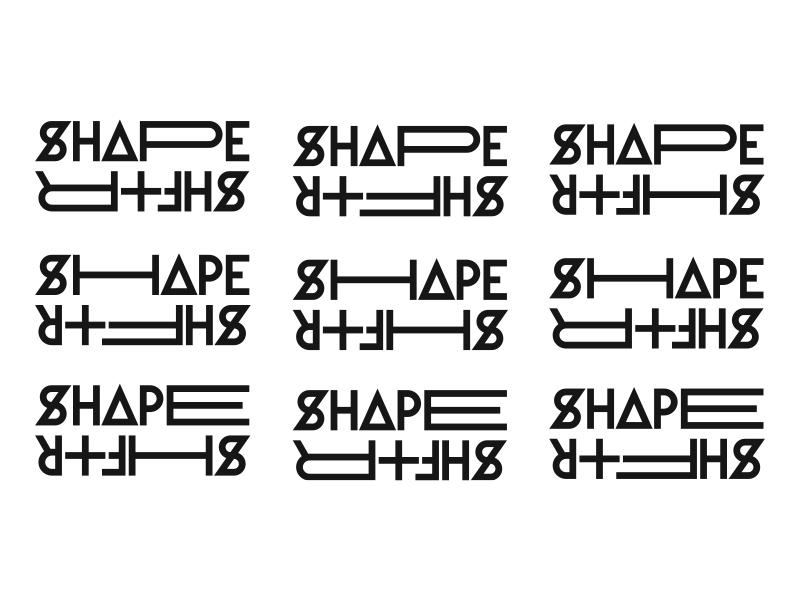
Shapeshftr

Stoked to show some more identity work from The Interior Plain Project, a snowboard company based out of the midwest
The idea is that the name of the new line, "Shapeshftr," would appear differently in every application. Therefore the identity itself embodies the idea of "shifting," and relies more on graphic device, rigorous application and the custom typeface I created, than on a solitary logo.