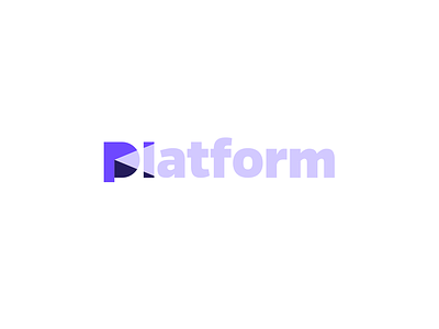
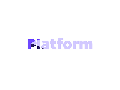
Platform
Platform refined identity.
Currently open for feedback on this refined version. Made the 'platform' element a little more in balance and the capital 'P' in line with the top part of the 'f'. in construction this feels making a lot of sense.. but in overall balance the longer 'P' feels more at is point. What do you think? Longer or shorter?
Check attachment for alternative 'P'.
View all tags
Posted on
Feb 29, 2016
More by Jeroen van Eerden View profile
Like


