Catch Wolf

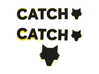
A close up of the previous wolf one that I liked. In the end the client didn't like the roughness of it. Thought it looked a bit too much like Brewdog, which is fair enough.
I'll definitely use this concept again. I love the hand-stamped look, and having a dynamic, changing logo. Also, the black and the yellow are a really interesting combination. Kind of plays with the eyes...