Hybrid
Can't say too much on this project yet as we're still in the infancy stages. Really enjoying some designing again after a prolonged period of front-end development work. My Field Notes book getting some hard use!
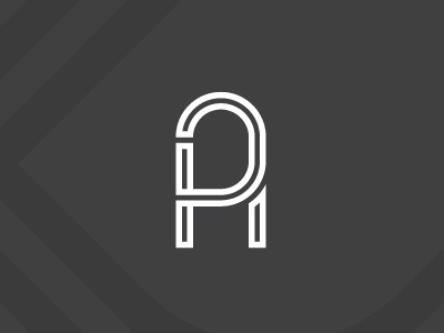
This monogram includes the letters 'H', 'A' and 'P'. The H takes a little more looking to see, as the lobe on the 'P' slightly obscures things. That said I don't think it's specifically detrimental to the overall feel of the logo icon. I really liked the flow and feel this concept has.
More by Mat Doidge View profile
Like


