Homepage Layout

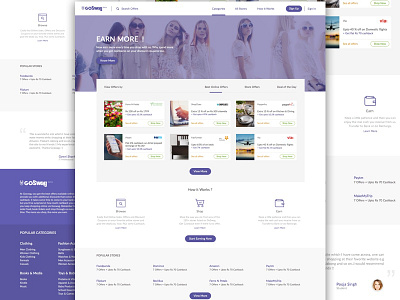

Worked on a fresh concept for a coupon site - Go Swag. The idea was to break away from the very box like structure of the existing page. In the current structure, each section looked like a bigger box with few other boxes inside it. It kind of overwhelmed me as a user.
So I created this whole juxtaposing of the deals section with the background image to break the monotony of too many aligned boxes. Moreover it makes much more easier for the user to switch between different deals and see what all is on offer unlike the current structure on which you have to scroll down and down to see more deals. Follow the link below to see the current site -
www.goswag.com
Show some love by pressing 'L' if you like the concept.