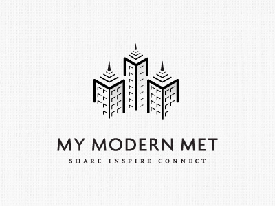
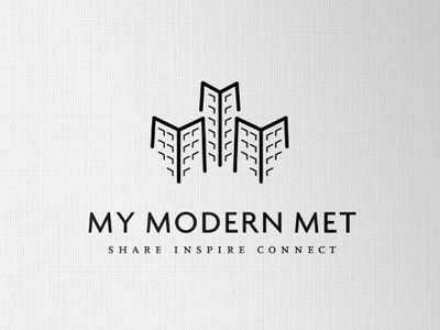
My Modern Met logo
Here we go again, further changes and stuff. A few of you mentioned about the windows and also the 'splaying' out of the bottom of the buildings. So have taken that to heart and altered the logo.
Have kept the walls dead vertical, as well as adjusting the window highlights for left and right on each wall face.
Also, to define the 3M's, I have thickened up stroke that makes the 'm' part of the buildings, and made the center wall stroke a little thinner.
Am experimenting with adding some roof detail, as a finishing touch, but not sure yet if this causes too much clutter. Also looking at subtle shading on one side of each building.
Thanks for previous feedback, the changes do work.
There are still some tweaks to make, the way which the bottom windows now seem to align oddly on the inside walls, due to flipping the window reflections etc.
Although the window strokes look a little inconsistent, they are all the same weight, it's just a display thing.


