'a' very repetitive evening!!!

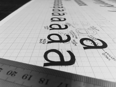
Designing the letter 'a' to feel at home with other letters is difficult, especially when the bowl needs to take up a lot of the form for legibility. It's all about balancing the thickness of the strokes and getting proportions right. Can be very frustrating!