


Email Notification


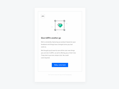


Hello. The challenge was to unify email layouts within UXPin.com notifications. At the beginning there were at least a few of them all with the different styles (oops). But we managed to make them consistent. Why we decided to redesign notifications in that style?
1. First of all, we belive illustrations can play an important role. Their style is inline with friendly and direct language of our Customer Support. We bring positive emotions to our emails, because UXPin is interested in building a long-term relationship with users. And now, our visual communication will be more consistent.
2. People can understand faster what emails are about without reading all the text. For example, we use green credit card illustration when payment confirmation happen, and pink one when something is wrong. They are more intuitive. But we do not overuse colours when we don't have to.
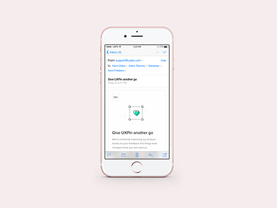
3. Not all of our previous emails were properly designed for mobile. Because of the single-column layout our new emails will be displayed properly across different devices.
PS. Note that they are related directly to editor, not newsletter or marketing.