Mac App Store WIP

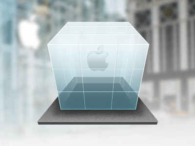
I'm working on a replacement icon for the Mac App Store app. I still need to mess around with the opacity of the shadow and glass, as well as the highlights. I've been staring at this for awhile and I'm having trouble determining if the perspective is right. What do you guys think?