Swish redesign


Swish is a simple and secure mobile payment service for individuals and businesses. It's one of the most downloaded apps in Sweden.
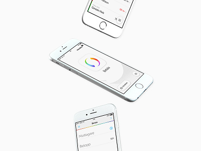
In autumn 2014, I got the opportunity to redesign the app together with @André Karlsson. We wanted to create a unified design—OS and device independent—with simplicity and clarity as a carrier for Swish. It was important to make the UI consistent and sustainable to preserve the essence of Swish: Pay easier.
When designing the UI, we really wanted to reduce some noise and get rid of the unnecessary information that was smudging parts of the design. We used the existing typeface Museo Sans Rounded and also based the new iconography on it's friendly and geometric look to achieve a consistent look and feel.
See attachments for a small part of the new design (splash, homescreen & nav) and the old design.
A more full case study available at niklasrosen.se/work/swish
Download the app here:
— App Store
— Google Play