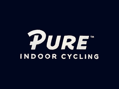
Pure - Sketch
I am currently in the sketch development stage of redesigning the logo of Pure, an indoor cycling studio located in the Chicagoland area. This is an option combining the “P” of another early sketch with “URE”. At first “URE” was connected to a more similar to the “R” looking “P” character but found this an interesting solution finding a more distinctive “P”.
Let me know your thoughts, looking for feedback.
View all tags
Posted on
Dec 1, 2015
More by Paul von Excite View profile
Like

