Power BI Visual


The Power BI Design Studio here at Microsoft was given the opportunity to create our own custom visualization with no strings attached. So we wanted to model the data we planned on showing around our design studio and the impact we've had since our inception.
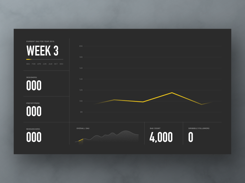
That said, with the help of some of my awesome team members we've come up with a direction as seen above. I built this visual at the end of last week and worked on the animation to show our prototypers how to execute on it.
There's a few things that aren't exact like the actual data behind this or the DAU count as it will fluctuate up and down in proportion to the heartbeat-esque line that is shown. Other than that everything is rather accurate. I look forward to seeing how our team builds this out. Stay tuned for more, I look forward to sharing our progress!